


Mockup of mobile design for US Airways seatmaps.
Mockup of mobile design for US Airways seatmaps.
View of the seatmap when choosing seats for US Airways flights during the booking workflow.
Comparison of the legends for Elite and non-elite user views.
Mobile wireframe with annotations for third-party integration (UsableNet).
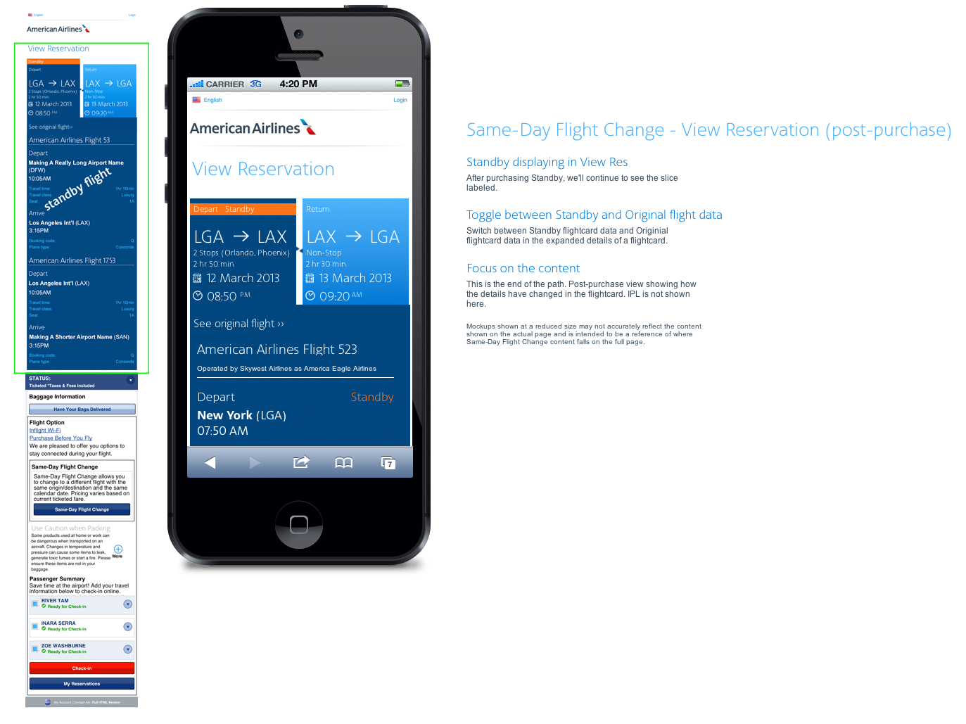
Mobile wireframe showing standby flight info of a reservation.
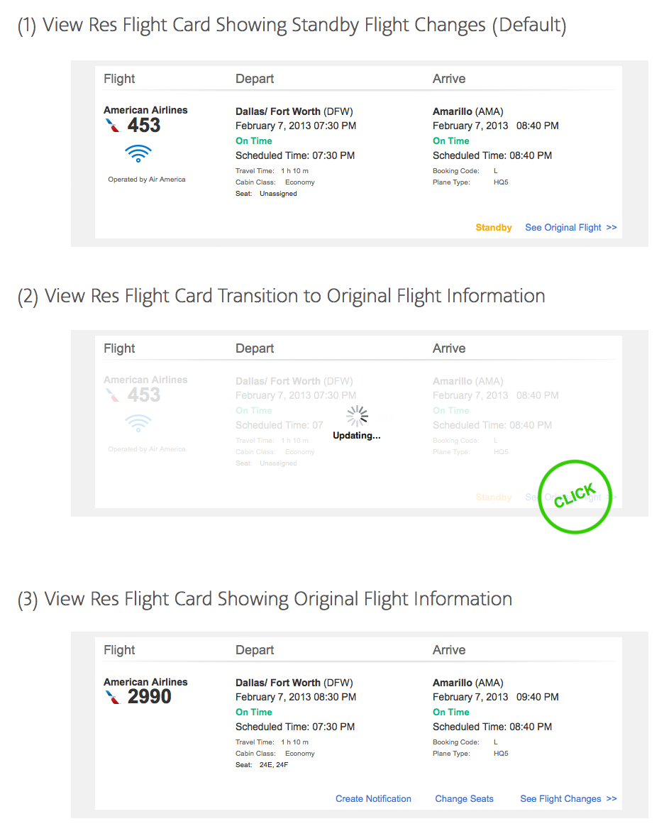
Shows how data toggles within the flightcard in cases where users have a Standby flight scheduled.
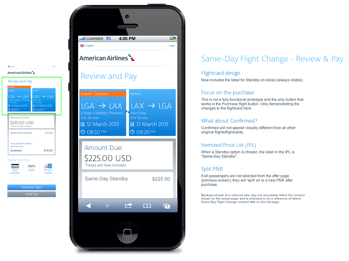
Various ways the UI would display offers based on user status and flight capacity.
Static wireframe of flightcard data toggle
High-fidelity wireframe showing data toggle for standby and confirmed flight info.
Wireframe showing flightcard UI in cases of standby flights with multiple stops.
Mobile view of the UI to make changes or remove the Group 1 Boarding product at the time of payment.
Interactive mobile wireframe of Group 1 Boarding UI along with annotations for 3rd party integration (UsableNet).
Module displays based on cabin availability and passenger data during the check-in process.
Group 1 Boarding UI embedded in the Trip Options page of the check-in process.
Desktop view of the UI to make changes or remove the Group 1 Boarding product at the time of payment.
Possible flows for various user conditions for the Group 1 Boarding product.
New branding standards and new UI shown in this hi-fi wireframe for each of the more than 30 modules on this page
Snapshot of the site's main hub, "View reservations", before the rebuild/rebrand effort began.
Updated UI for showing status on your most recent trips.
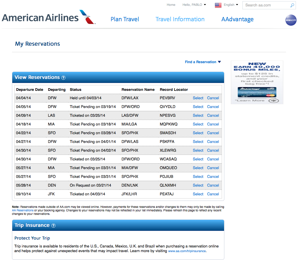
Snapshot of the My Reservations page before the rebuild/rebrand effort began.
Updating the branding standards and user experience of the Change Reservations tool for aa.com. This screen shows the summary of flights users desire to change (including cost summary and upgrade offer).
Snapshot of the tool in production (aa.com) before the rebuild/rebrand.
Step one (1) of the Change Reservations process for aa.com. Selected eligible flights are pre-poulated with data from the reservation with options to change cabin or fare type.
Snapshot of the Change Reservation tool for step one (1) of the process. Shown for comparison and baseline for new UX.
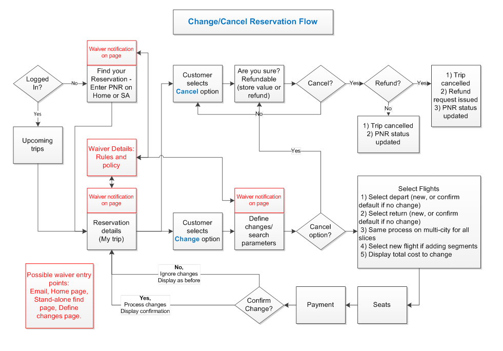
User workflow with various scenarios based on processing travel waivers and refunds.
Snapshot of the upgraded header for Dallas Market Center website
Snapshot of default view for dallasmarketcenter.com before rebuild effort
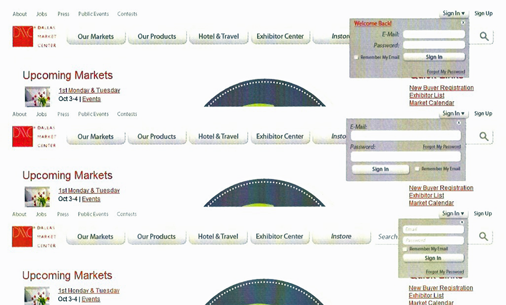
UI before rebuild effort - shows disjointed sign in UI after user chooses "Sign in" button.
Sign in UI exposed in header
All states of sign-in UI (guest, sign-in, secure)
Sign in using an overlay for UI
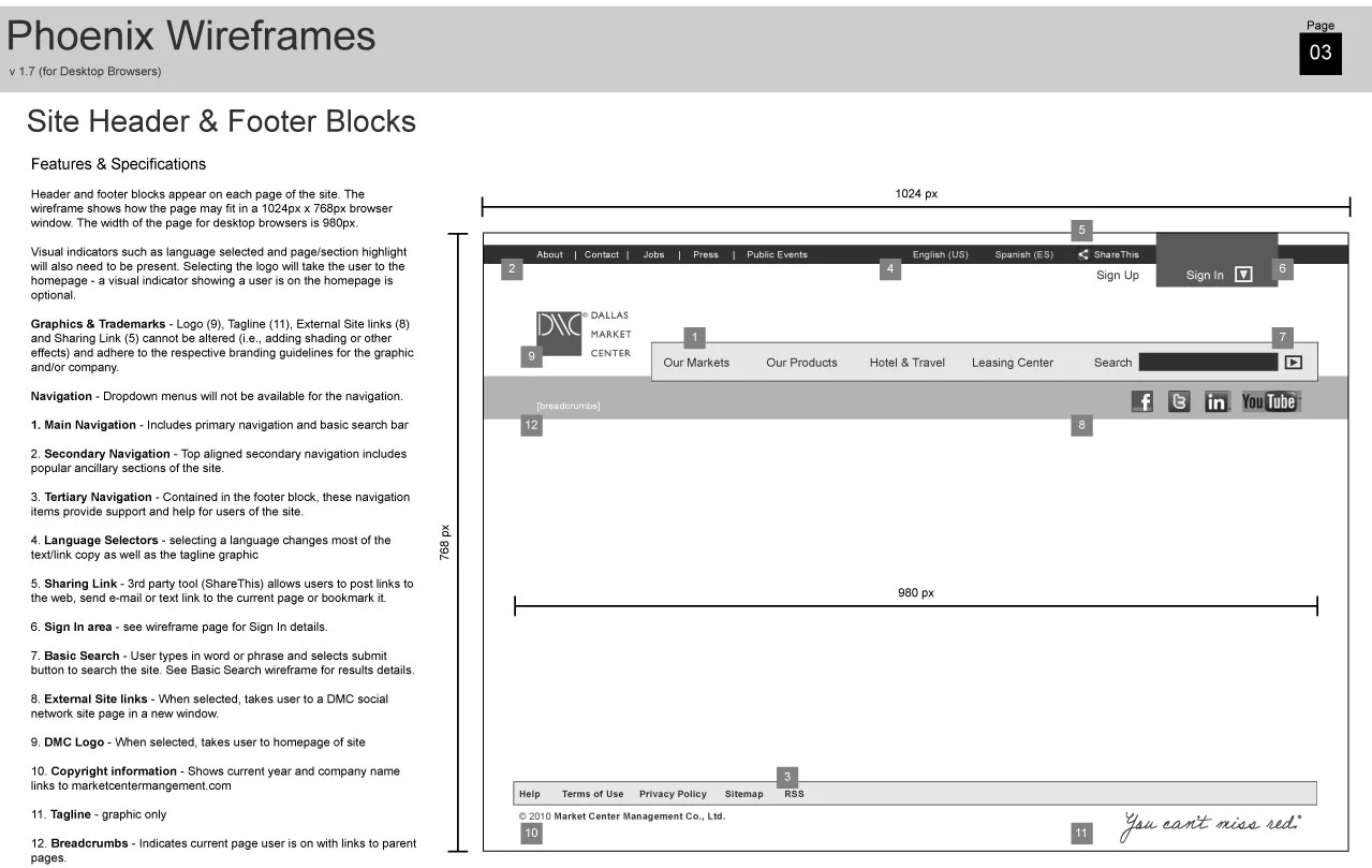
Design detail and annotated specifications for dallasmarketcenter.com header/footer
Wireframe showing the basic layout and sizing of elements
Individual containers of page elements footnoted here.
Signup form steps (dynamic regions outlined with dashed lines)
Wireframe of tools for filtering exhibitor search results
Wireframe for interactive map tool where users can find exhibitors and events throughout the campus
Diagram of possible navigation scenarios when using the interactive map tool for dallasmarketcenter.com
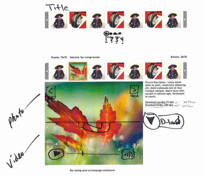
Initial design of media gallery holding images and video
Suggested improvements to UI
Media gallery with multiple galleries of images and videos
UI displaying a selected image from the gallery
UI displayed selected video from the gallery
Simple and compact media gallery UI
Annotated module features
Final solution implemented in the dallasmarketcenter.com site
Wireframe showing possible homepage content based on user status.
Wireframe showing guest and secure users UI for the header along with a footer UI.
Wireframe of a seller's product detail.
Site navigation mapping
Refined version of CCHD Style Tile 02 with better readability and brighter colors
Shows incoming data from a pulse oximeter device and assigns data to site of the body based on user interaction.
Early prototype of the CCHD screening app. Used Axure to build the desired functionality, helped me work out may of the bugs and find new questions.
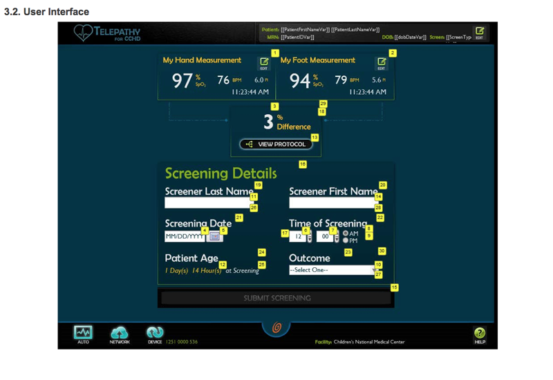
The last step for screening shows a summary of data you're about to submit and has a form for the screener to add their details for traceability.
Bold colors and light background
Light copy and icons and dark background
Documentation for specs of a given screen in the CCHD Screening Application
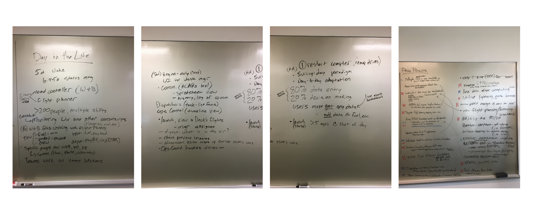
Before any work on design, layout or coding begins - it's important to have a map of the workflow a user can take and account for all the data we need to capture.